I admit I have a love-hate relationship with interactive content. Yes, we live in a world of content overload and interactive content is one way marketers can try to stand out. However, in the same way Word doesn’t make you a writer, easy to use tools don’t make you an interactive designer. The world is increasingly littered with quizzes, flipcards, clickable images and 360 videos just because they are easy to produce but no one shares or engages with this content. On the other hand there are some fantastic interactive examples. This month I have picked out twenty examples that really resonated with their audience.
I have grouped these twenty examples into four broad categories as follows:
- Quizzes
- Calculators and interactive tools
- Interactive sliders, timelines and images
- Interactive and 360 Video
Quizzes
Quizzes have long been a favourite engagement tool, particularly on Facebook with some quizzes gaining over 2m shares. As a consequence you won’t go many days without seeing quizzes pop up in your feed.
Quizzes can vary from a simple outcome based quiz (in essence a diagnostic that predicts your management style, the decade you were born or your Hogwarts House) through to quizzes that are effectively assessments. They’re quick to produce, they help people feel good about themselves, and are very shareable. Publishers also realised that if you called a quiz the most difficult ever and made it easy, so people got high scores, they were very likely to share it. Call me a cynic but people like to show how smart they are. So unfortunately the world is full of poor quality quizzes that are never shared but here are some that really resonated with their audience.
How many of these quizzes can you score 100% on (see what we did there)?

This is my personal favourite quiz as a tennis fan. The quiz is from the Wall Street Journal. The content has had 22,000 shares and it is a great example of an engaging quiz targeted at a specific audience. It has also gained 129 links from unique domains. Move over Hawkeye. Rumors that John McEnroe has done this one 21,000 times are unfounded.

I am not a a fan of the ‘see how smart you are’ headline but I had to include this grammar quiz because it gathered an amazing 5m shares last year. There are clearly many people that want to prove their grammar skills to their friends and show just how smart they are. I apologise in advance for any split infinitives that appear in this post.

Elections are the ultimate quiz in a way. So in the last election year this political quiz from “I side with” was very popular as it leveraged a trending topic. It asks for your views on various issues and shows you which political candidate you side with the most. It was shared over one million times. There are also different country versions of the quiz. So if you didn’t already know who you should vote for, give it a spin. Just remember vote early and vote often, or was that for Dancing with the Stars? Also, ask your local representative to take the quiz.

Forget grammar. If you really want to show everyone how stellar you are, take a science quiz. This quiz from Pew Research Center received over 800,000 shares. So if you know your comets from your asteroids, this is for you. Share your results with the whole cast of Big Bang Theory.
Calculators and tools
Beyond quizzes, practical and useful content always does well. I think practical tools such as calculators have been neglected by many marketers. They take more time to develop but can drive high levels of engagement, shares and importantly links as they can be very useful to the audience and have lasting value. In the marketing space Hubspot’s Site Grader tool is one of the most well known.

Health insurance is a big issue. This calculator from the Henry J. Kaiser Family Foundation calculates what assistance you might be entitled to and the costs of health insurance. This calculator has been shared over 125,000 times and has also received over 3,000 links from unique domains. So if you want to know just how bad things might be, this is very helpful. Also widely shared this year were articles about moving to Canada, which is just a coincidence.

I am not sure about you but I am not keen on knowing how many years I have left. However, many people seem hell-bent on knowing when the bell will toll, and over 70,000 of them have shared this calculator and 400 sites have linked to it. Luckily it says I still have a few years left in me. So there’s plenty of time for analyzing more content marketing. Life is short (according to this calculator at least), so let’s move on…

There are many variations of calorie calculator available on the web. This particular example has gained over 780 links from unique domains as well as 29,000 shares. There are also many niche calculators such as this one that calculates the calories in alcohol. If you want to ruin any party, be sure to whip this one out.

I suspect this is a very British Problem to solve, but the BBC produced this class calculator which has been shared over 360,000 times and has over 500 links. The content creators here really knew their audience and over a million of them wanted to know their social class. Answering questions being asked by your audience is one of the best ways to ensure your content will resonate. Truly posh people don’t really use the internet though, so there may be some in-built limitations to this one.

Staying with rather English preoccupations: Gardening is a popular hobby and this tool has gained over 20,000 shares and 140 links. It does require you to sign up immediately which I personally don’t like. The tool though is easy to use, and you can save your designs. Never again face the horror of planting your Adam’s Needle in the wrong shrubbery.

This interactive tool was developed for Shell as part of their ‘Make The Future’ initiative. The focus was on bright energy ideas and developing cleaner energy. The tool was shared over 300,000 times on Facebook. For some reason mixing a music video gets a lot more attention than my recent post on effective blog headlines.
This is our first entry from The Guardian, who have focused a lot on explainer and interactive content this year. You simply enter your date of birth and the interactive chart shows how temperatures have increased in your lifetime, and what the rest of your pitifully short (assuming you’ve done number 6) and rather overheated life holds. This is not the most exciting interaction but it gains from making it personal.

Interactive sliders and images
These are often used to help explain timelines or to show comparisons. They’re effectively interactive picture list posts, which we’ve talked about before.

This second example from The Guardian is a good example of an interactive slider to allow the user to compare two images, in this case photographs of the same area from the 1860s with contemporary photographs. This particular content has had over 200,000 shares.

This is a classic example of an interactive timeline which has been shared over 90,000 times on Facebook. Your life is less eventful than BB King’s. Just to manage your expectations now.

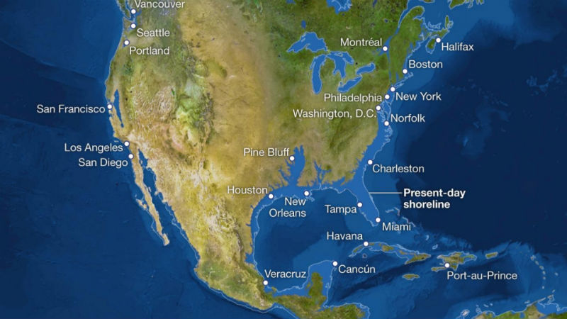
This interactive is really just a set of sliding images but the images are dramatic. If you live in Florida look away now. Your shoreline is in Georgia.

People like maps and interactive maps in particular. This is an example of a time lapse map showing the loss of Indian land over time. Good one to bring out at the Thanksgiving dinner next time you want to stir things up

This beautiful map is something that could have been designed by Sheldon Cooper, and I don’t pretend to understand it. However, 26,000 people loved it enough to share, and 128 sites have linked to it. Lovely to look it, just please don’t quiz us on it.

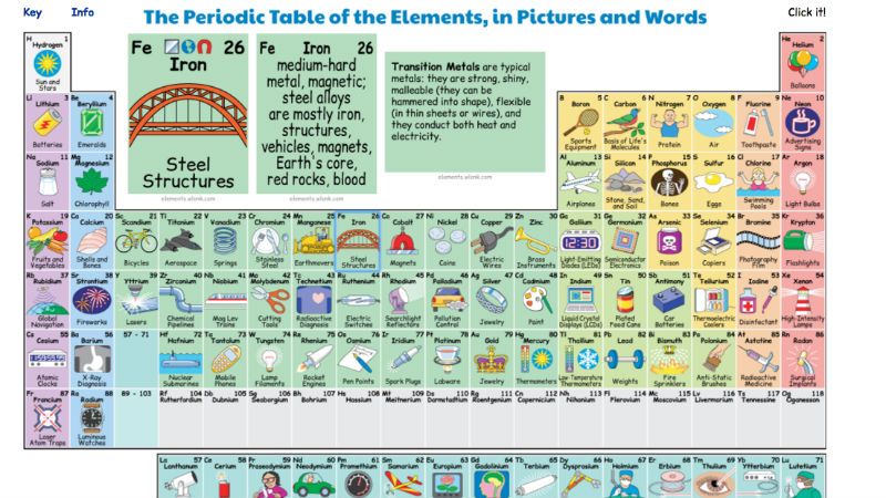
Building on the one infographic we all had to learn in school, this interactive Periodic Table shows how elements are used in everyday life and has been shared by over 70,000 people. TED produced a similar interactive table using video here http://ift.tt/1zn7XU3.

This is a simple clickable image which shows Greek debt over time and who is owed money. They love running this one in Germany. Actually they probably love it in Greece too.
Interactive Video

We are increasingly seeing interactive and 360 video. Here is a good example from Scott Manley on YouTube. You can rotate the video to explore as you move through space. This video has been viewed more than 600,000 times. Great quality and it inspires awe and wonder which make content very shareable.

This one is a mash up of a quiz, assessment and interactive video – are you good enough to work at Deloitte? Hint: Don’t throw water into the copy machine and you just might make it. This interactive video example from Rapt Media has been well referenced, but it is worth including as it is a classic example of an interactive video where the user can choose options as the video progresses. The same principles are behind this interactive video for Maybelline New York, also from Rapt Media http://ift.tt/2rqdkkn
if you want to learn more here are twenty ways you can use interactive video.
Summary
Interactive content can be a great way to make your content stand out from the crowd and to gain both shares and links. However, remember the world doesn’t need another pretty clickable infographic or a simple quiz.
Be creative. Make the content practical, awe-inspiring, and beautiful or alternatively make your interactive content really practical like some of the calculators. That you’ll be that much closer to standing out. Hopefully these examples will have helped inspire you.
So what works in your industry or sector? Use BuzzSumo to search for content by type – you can see the best performing videos, infographics and more in your sector. Search for your topic and add terms such as interactive, quiz, calculator, etc. to see what is working in your industry.
The post 20 Examples Of Truly Engaging Interactive Content appeared first on BuzzSumo.
from BuzzSumo http://ift.tt/2xvf2Xi
via Buzzsumo ref=da&site=blogger">IFTTT
